Century: Spice Road
Why did I re-design an existing board game?
While the original game Century: Spice Road and its fantasy-themed alternate edition are lovely, I felt it was a bit overproduced.
I mean sure, the oversized cards are nice (and the metal coins, and the small bowls for cubes), but they felt mostly like an attempt to boost the shelf/ table presence of a card game about trading cubes for other cubes.
Smaller box
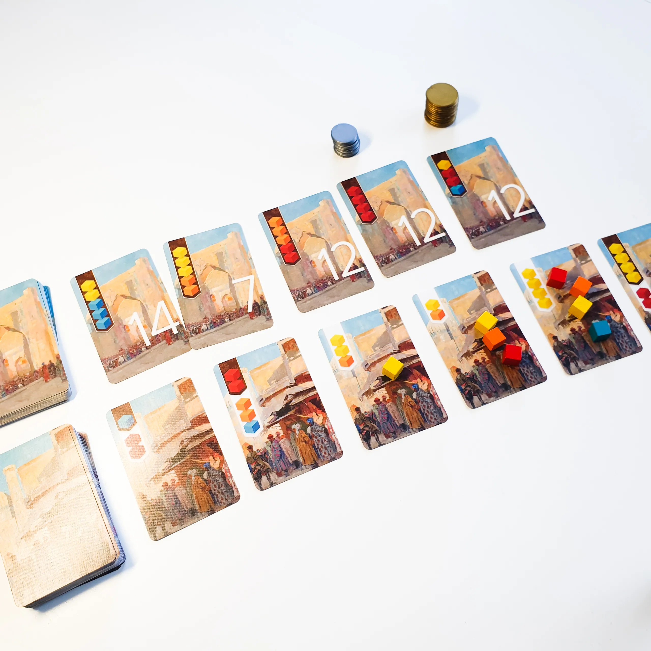
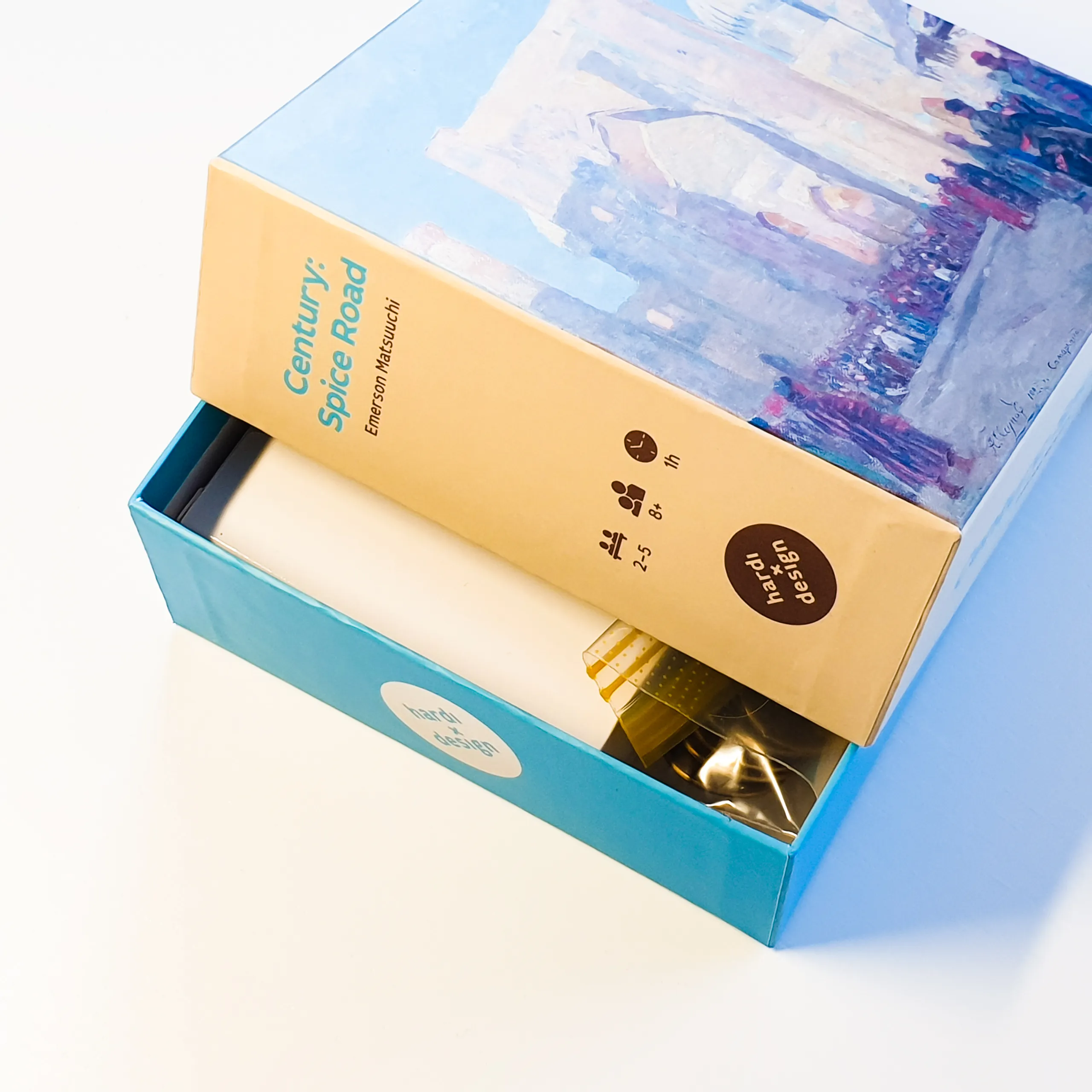
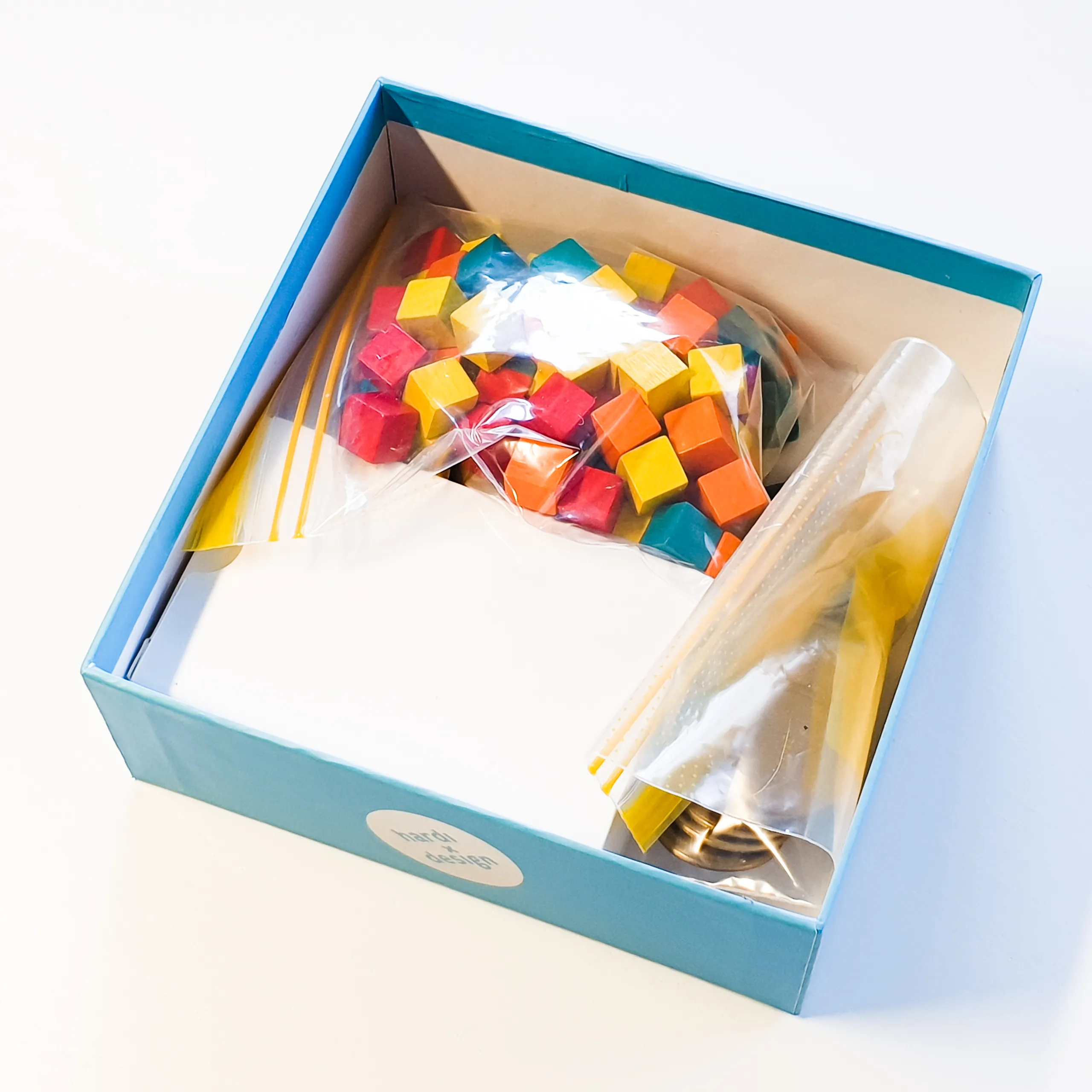
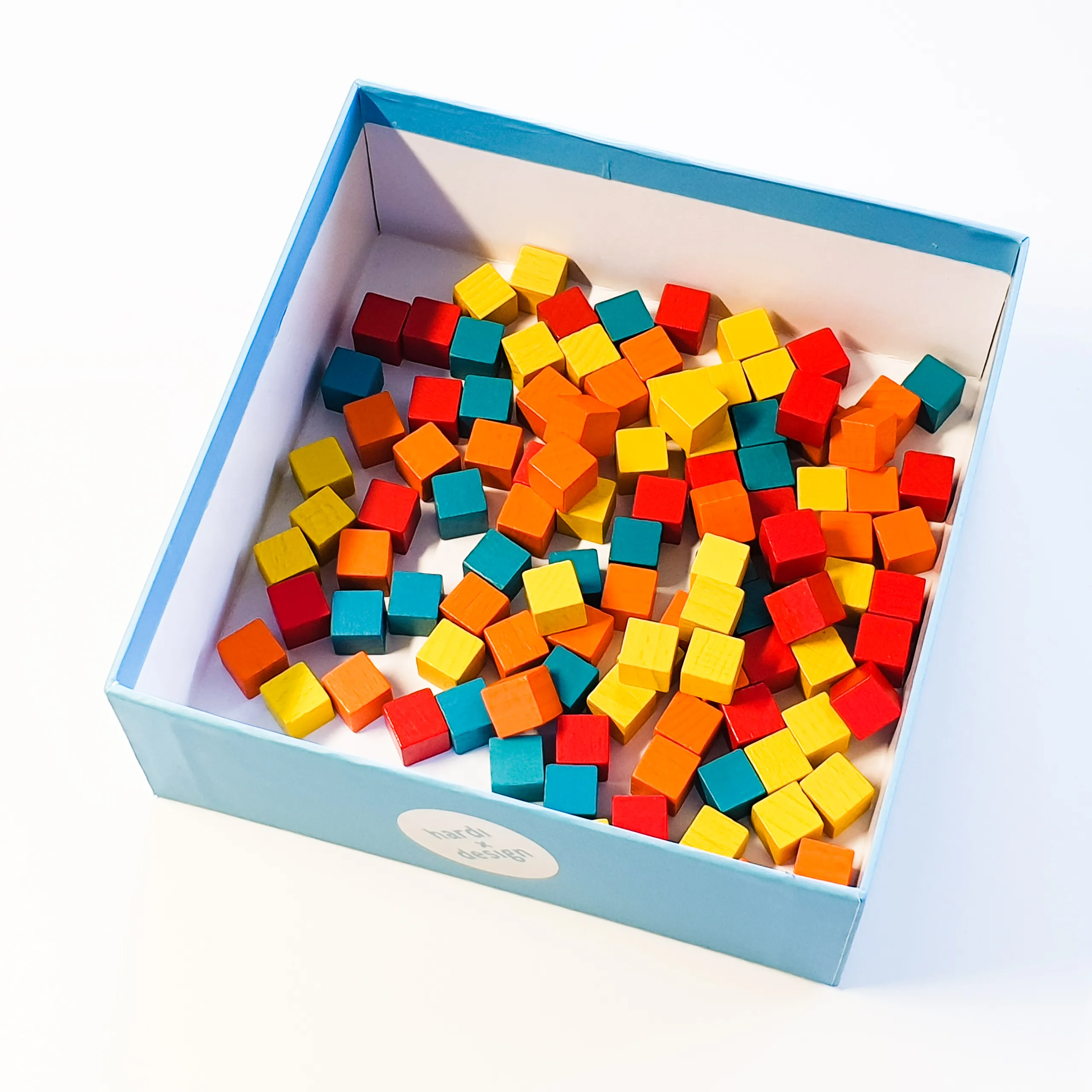
My preferred box size is a humble square, measuring 140×140×50mm. Compared to the original, my version takes 3,5× less space on my shelf 😀. Got to focus on the important metrics.
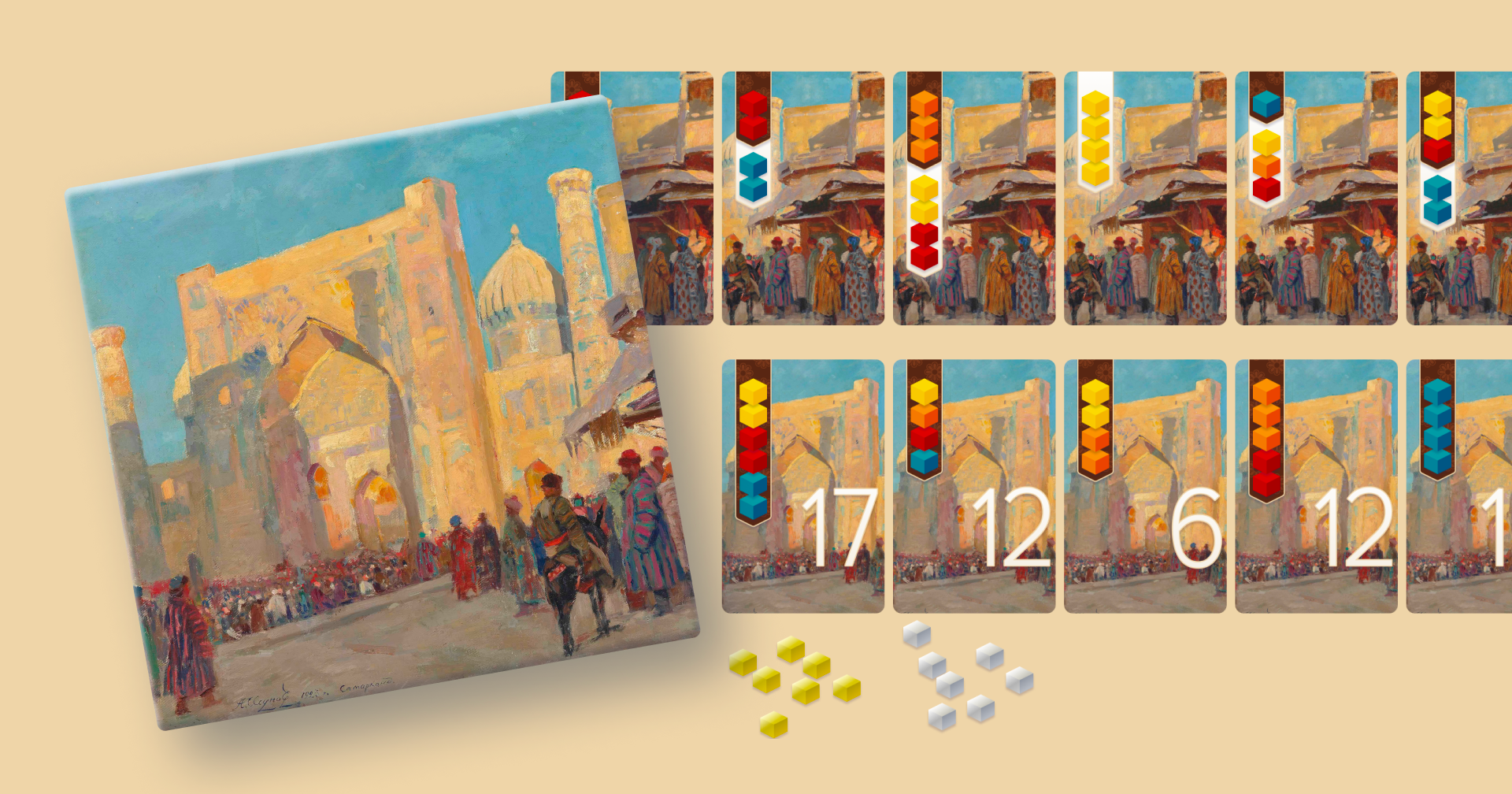
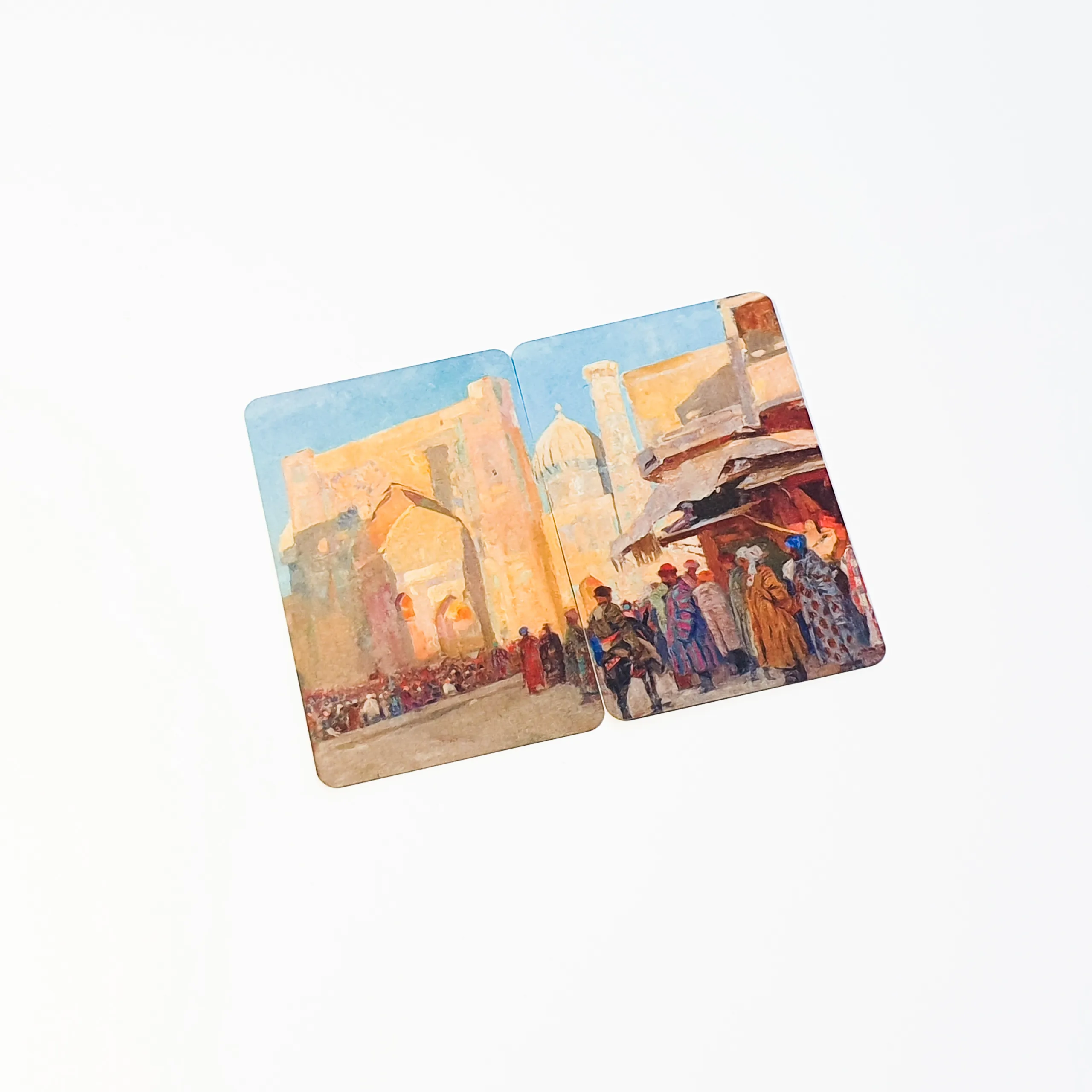
Image used on the box cover and cards is Samarkand, painted in 1923 by Alessio Issupoff (1889–1957). It’s a lovely public domain painting and I felt it had the right feel and colour scheme for a spice road game.
Smaller cards
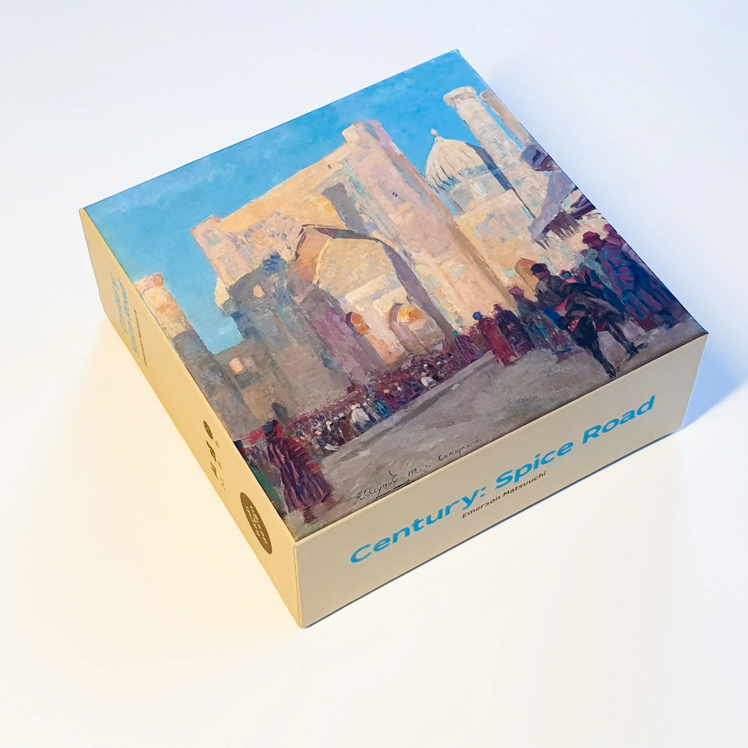
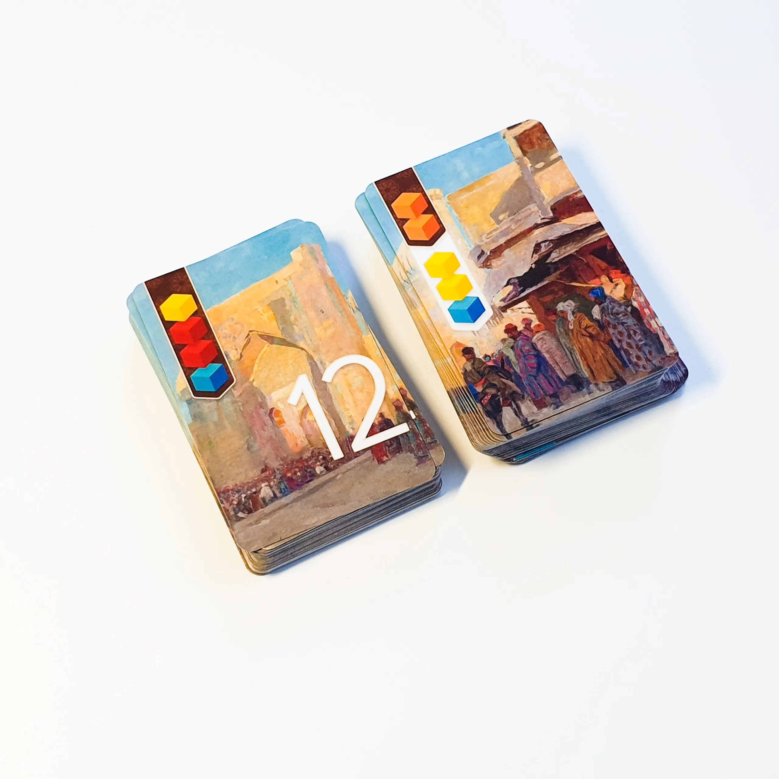
Cards in my version are regular bridge-sized cards (89×57mm) with linen finish. Poker-sized cards are more common, but I would use them only if the cards have text on them. On a bridge-sized card the line-lengths would be too short to fit text comfortably.
The cards with numbers give you Victory Points when acquired. The cards with a white banner are used for conversion. In this example, you would trade two orange cubes into two yellow and one turquoise.
Rules summary
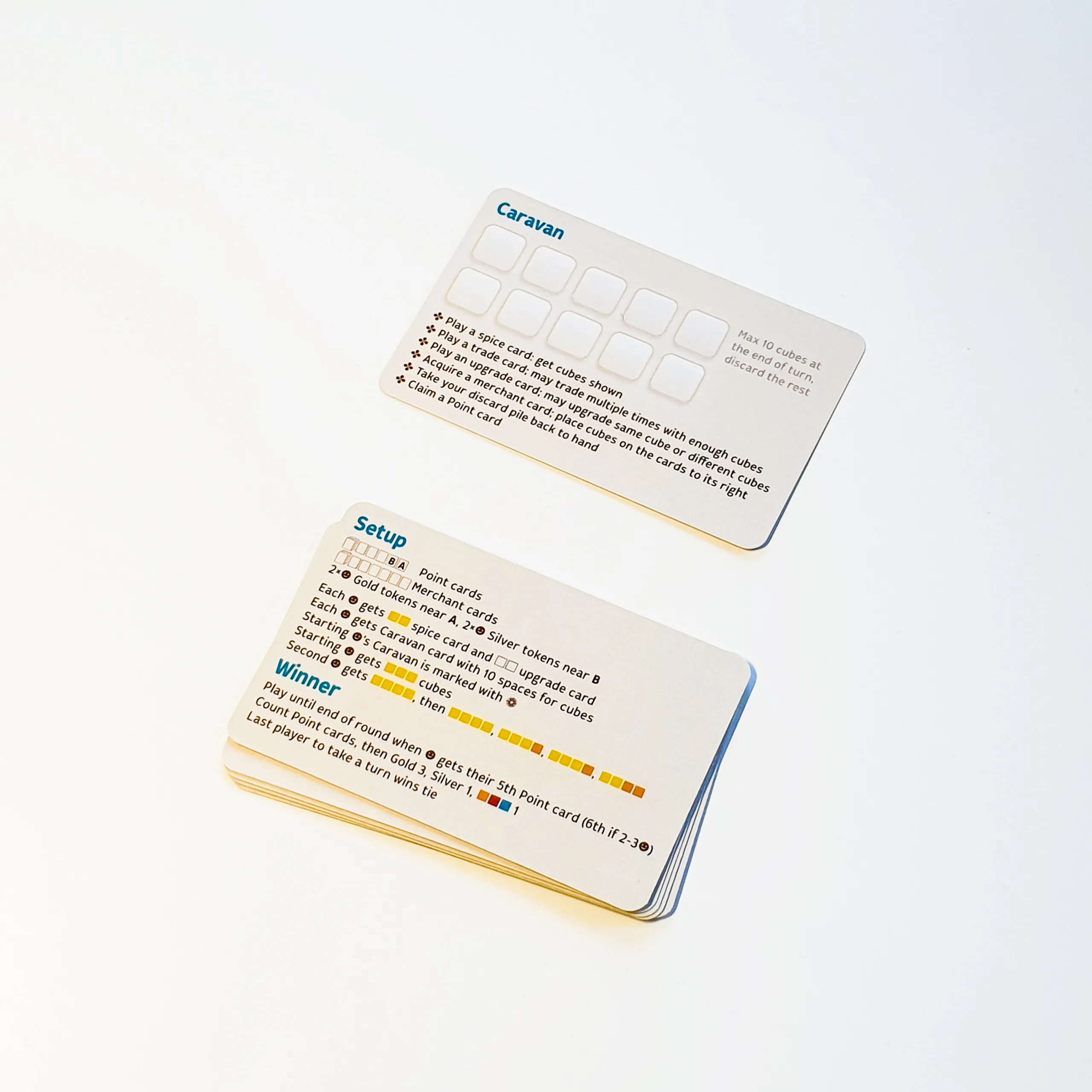
When I played the original game, new players often forgot what they could do on their turn. Since they already have a Caravan card in front of them to remind that they’re limited to 10 cubes, I just added action reminders.
On the other side of the Caravan card are setup and win condition summaries.
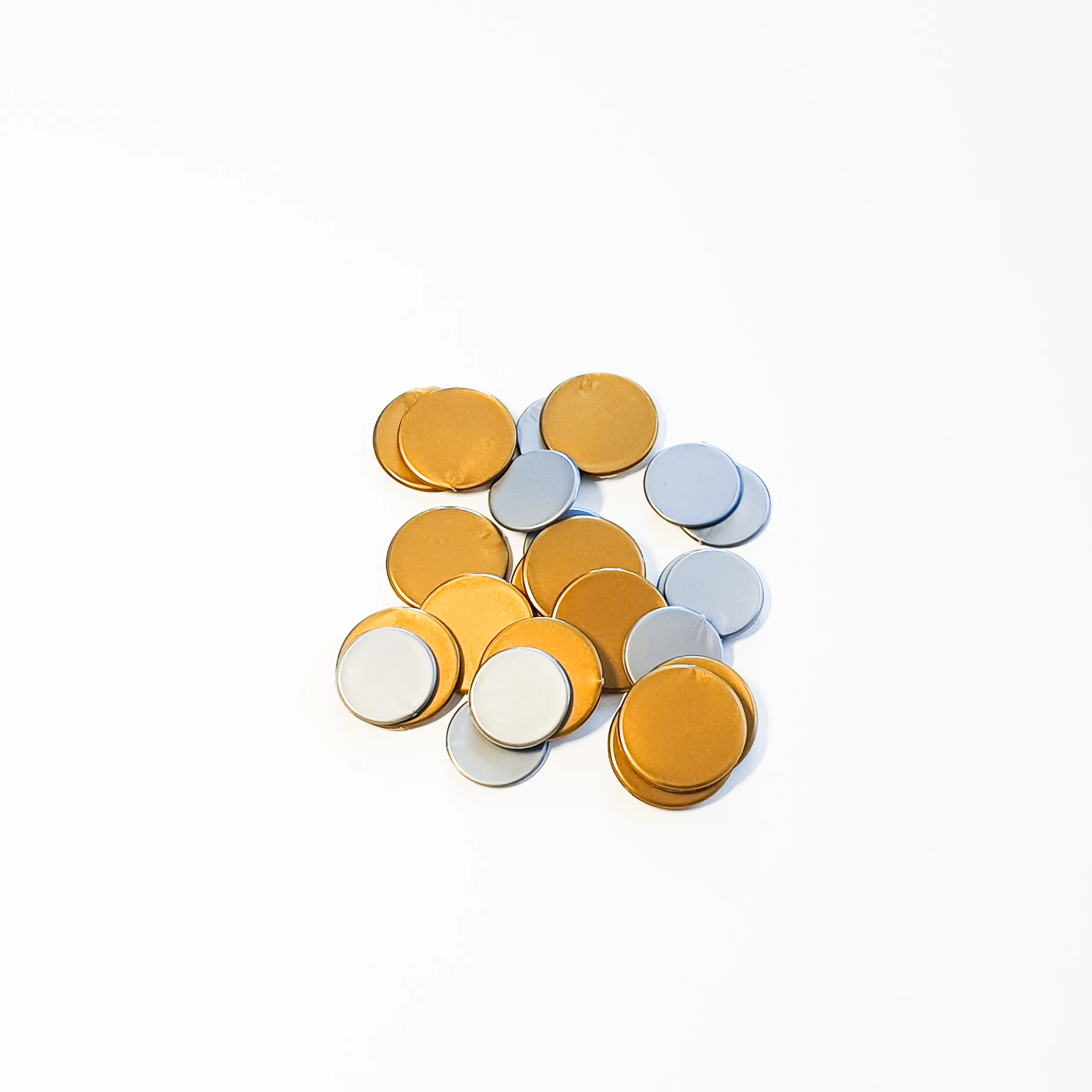
These coins are certainly not as premium-feeling as metal coins would be, but for scoring tokens they are certainly good enough.
