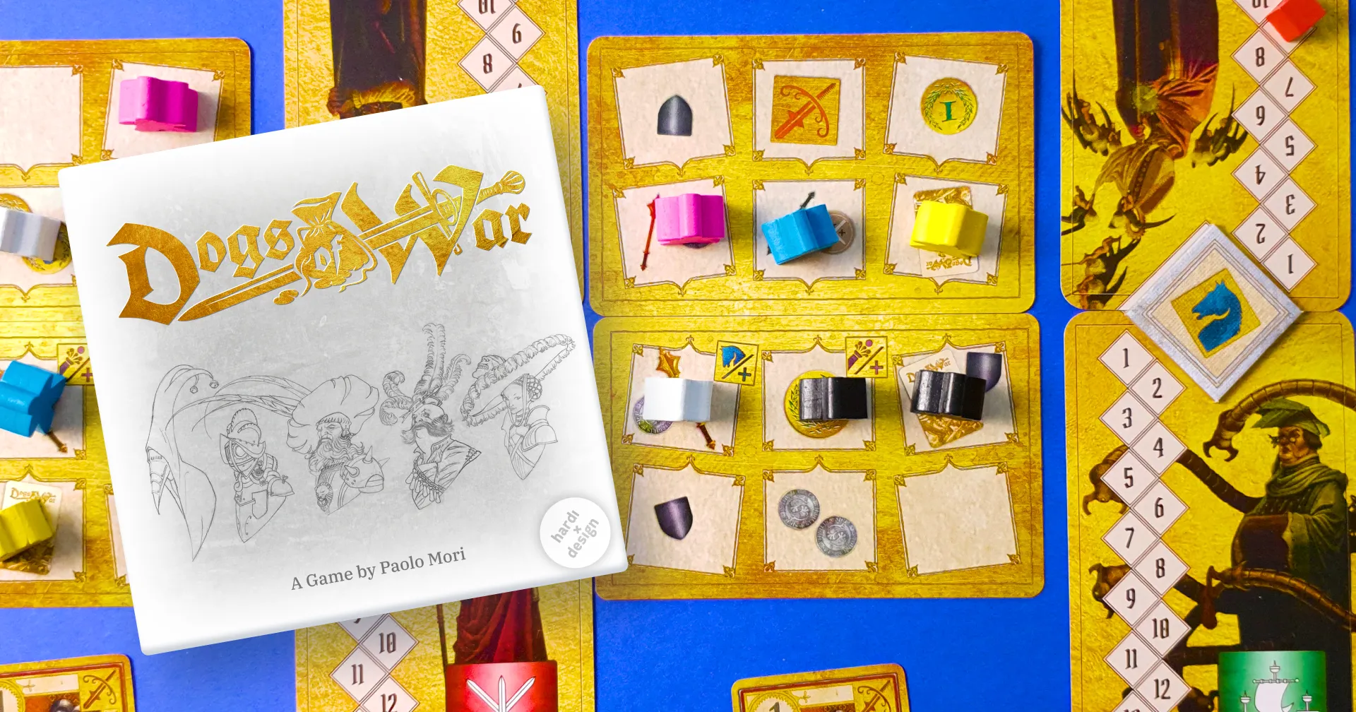
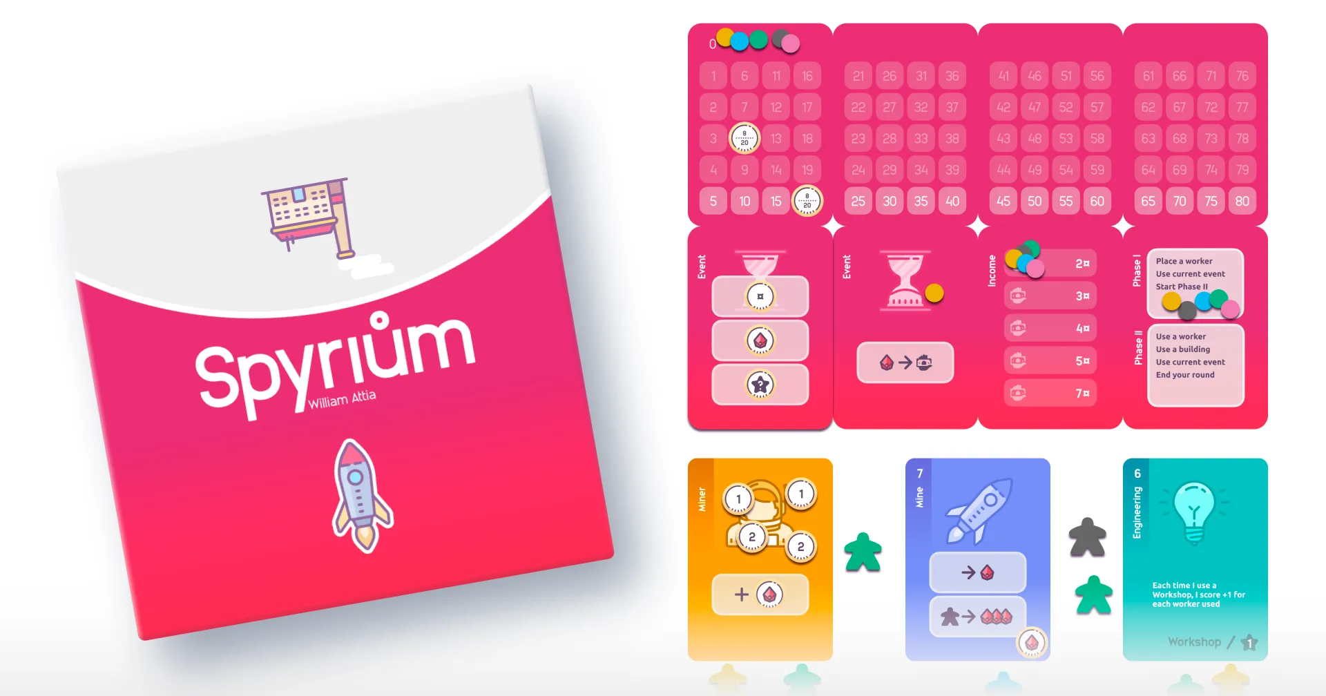
Spyrium
Why did I re-design an existing board game?
Clearer on the table
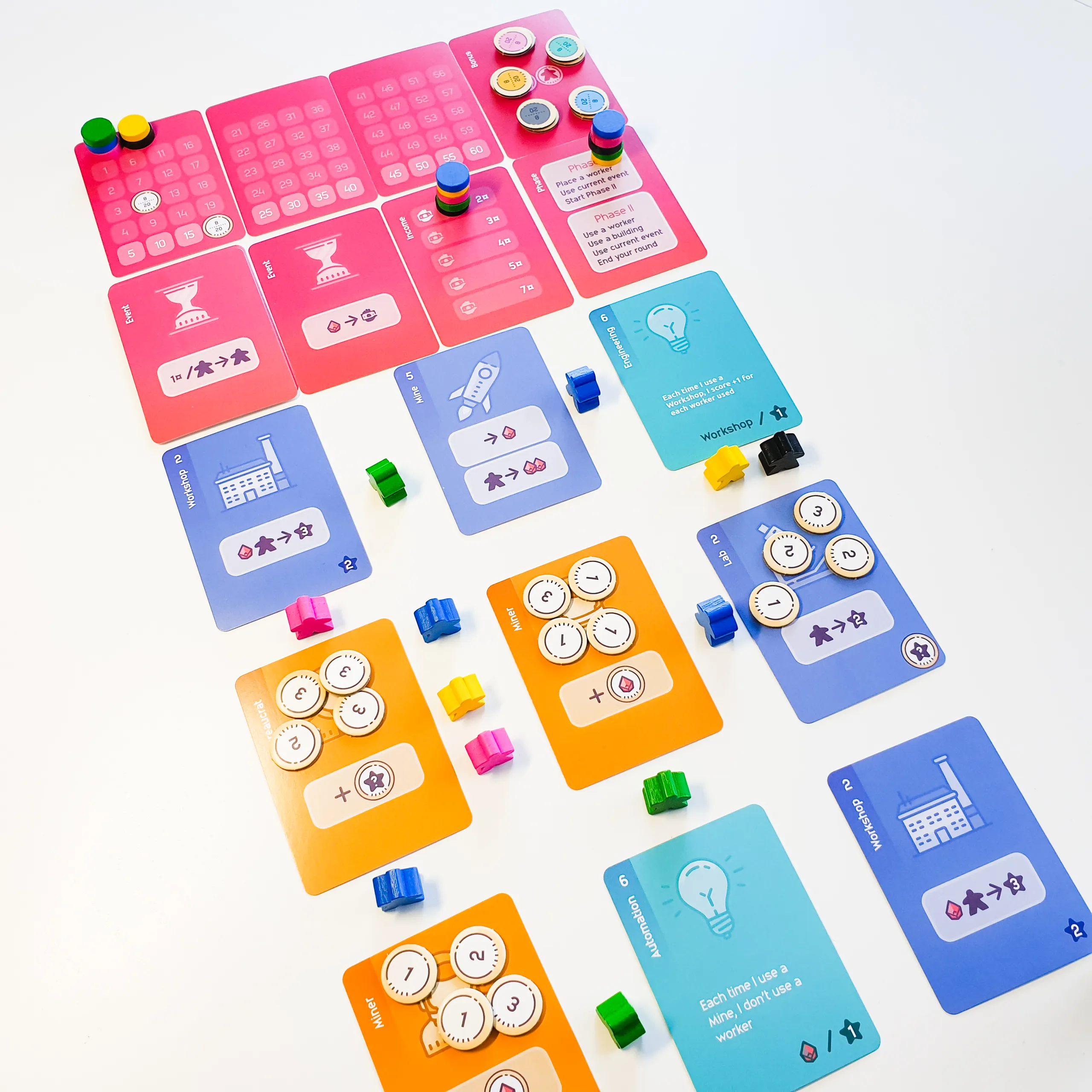
Original uses a steampunk theme which has low contrast and can be hard to distinguish when playing in the evening. I chose instead a very flat look that still keeps some thematic touches but mainly focuses on clarity and ease of learning the game.
Easier to teach
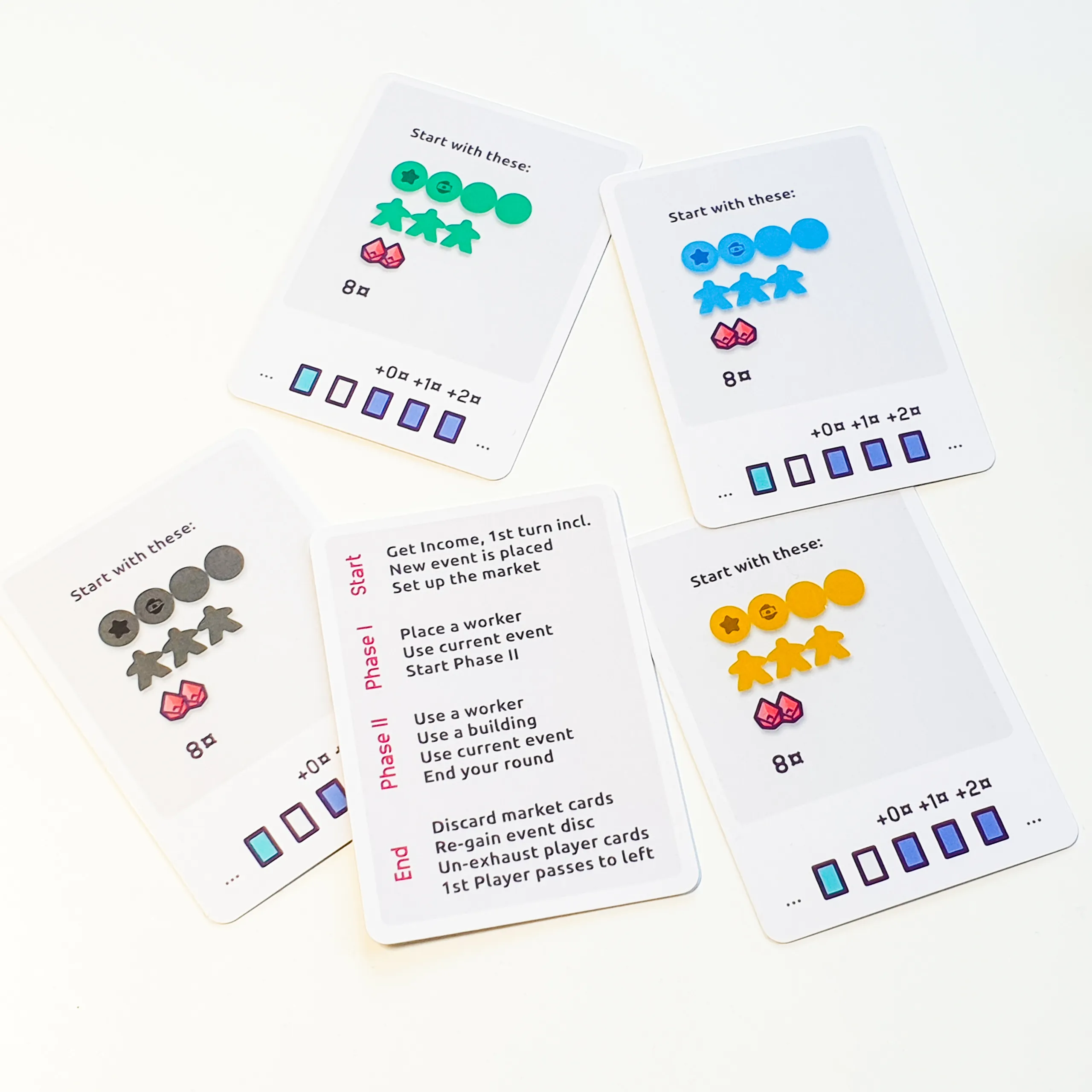
Original uses icons for everything, which means newer players need to look up a lot of things, thus slowing the game down since there is a single printed rules booklet. I kept icons for most things, but used text for tech cards (like automation above) with unique effects, and the player reference cards.
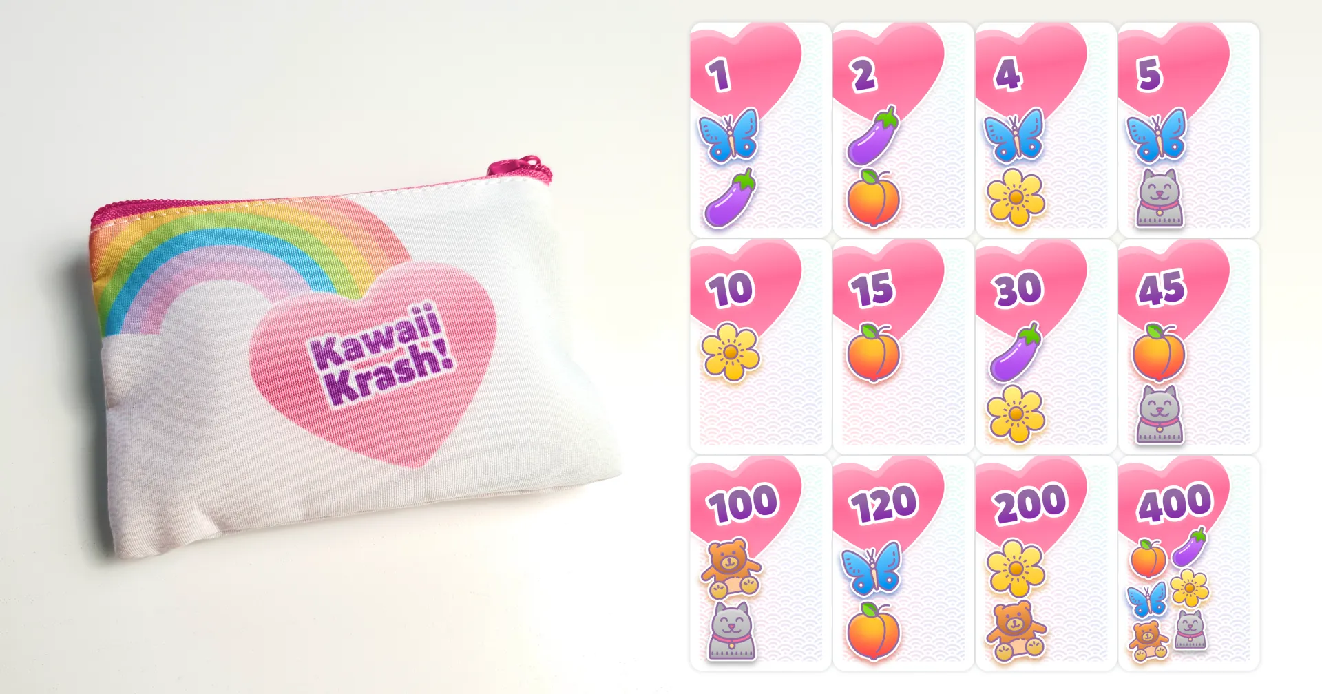
The illustrations are actually icons from icons8 Cute Color set, since I just needed some subtle differentiation between the cards. For a more thematic project, I’d go with a more art-heavy approach.
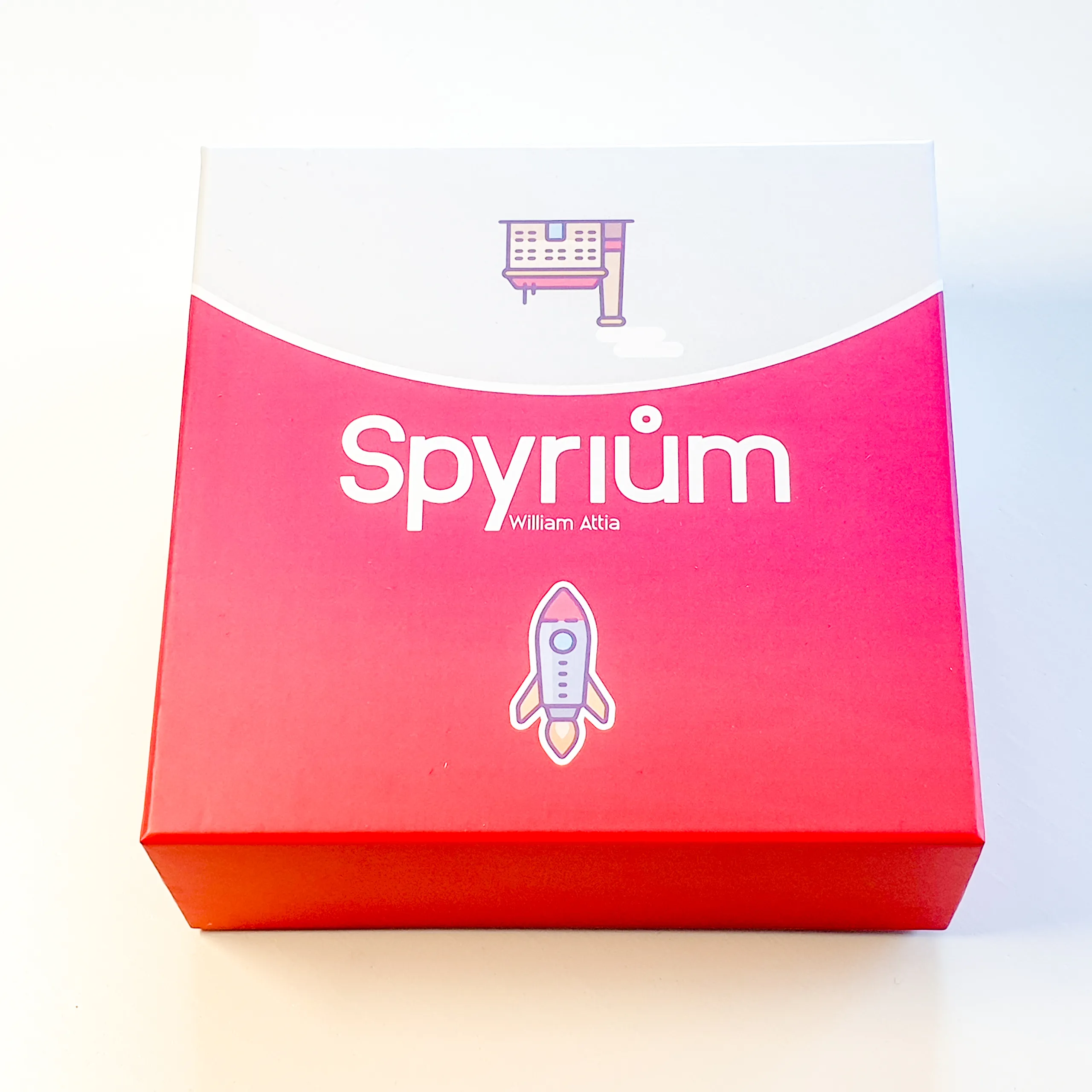
Nicer box
Somewhat inspired by the clean abstract style of Oink Games I went with a very bright box that would get attention at gaming nights.
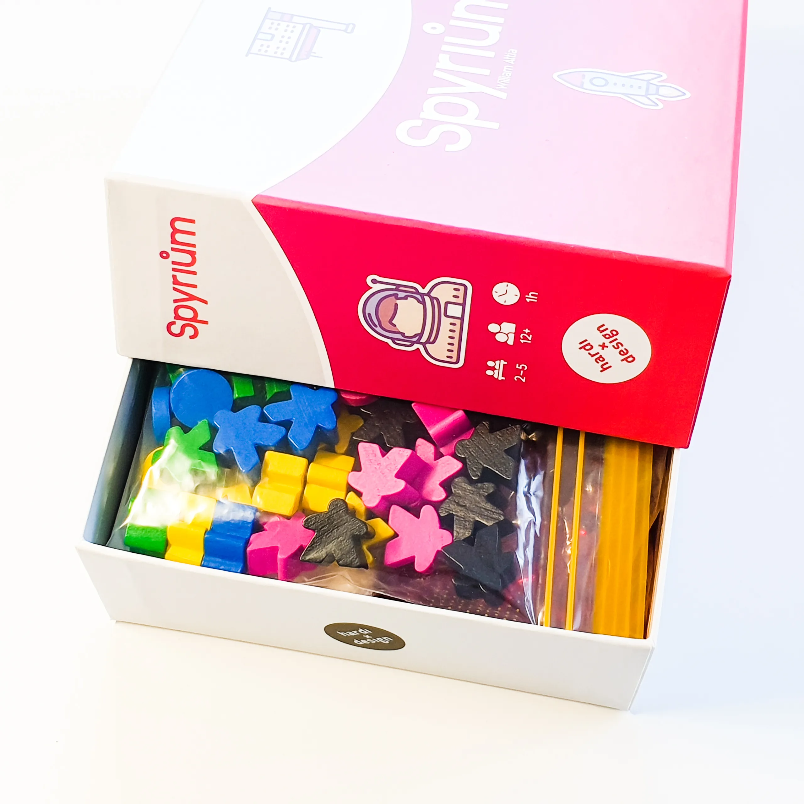
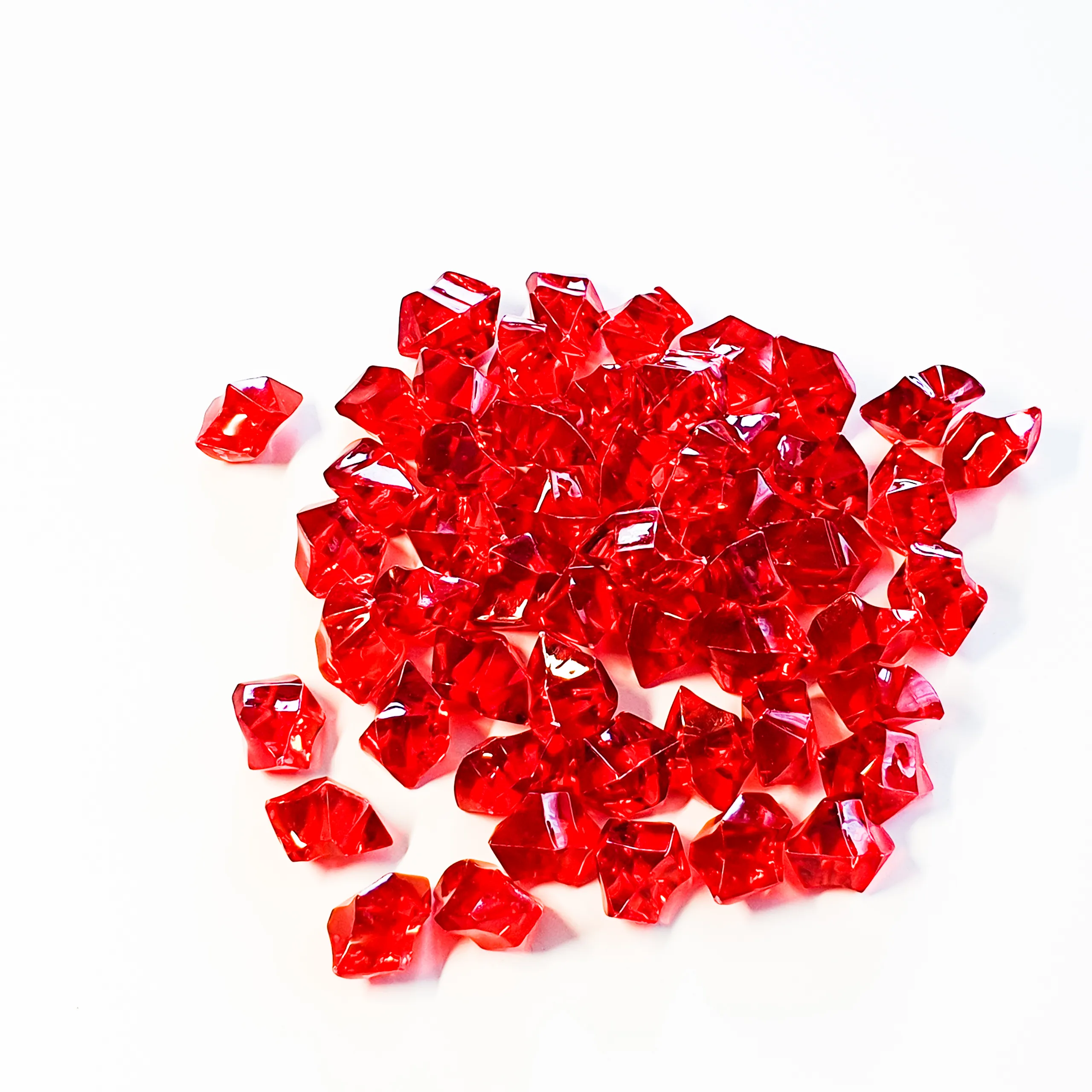
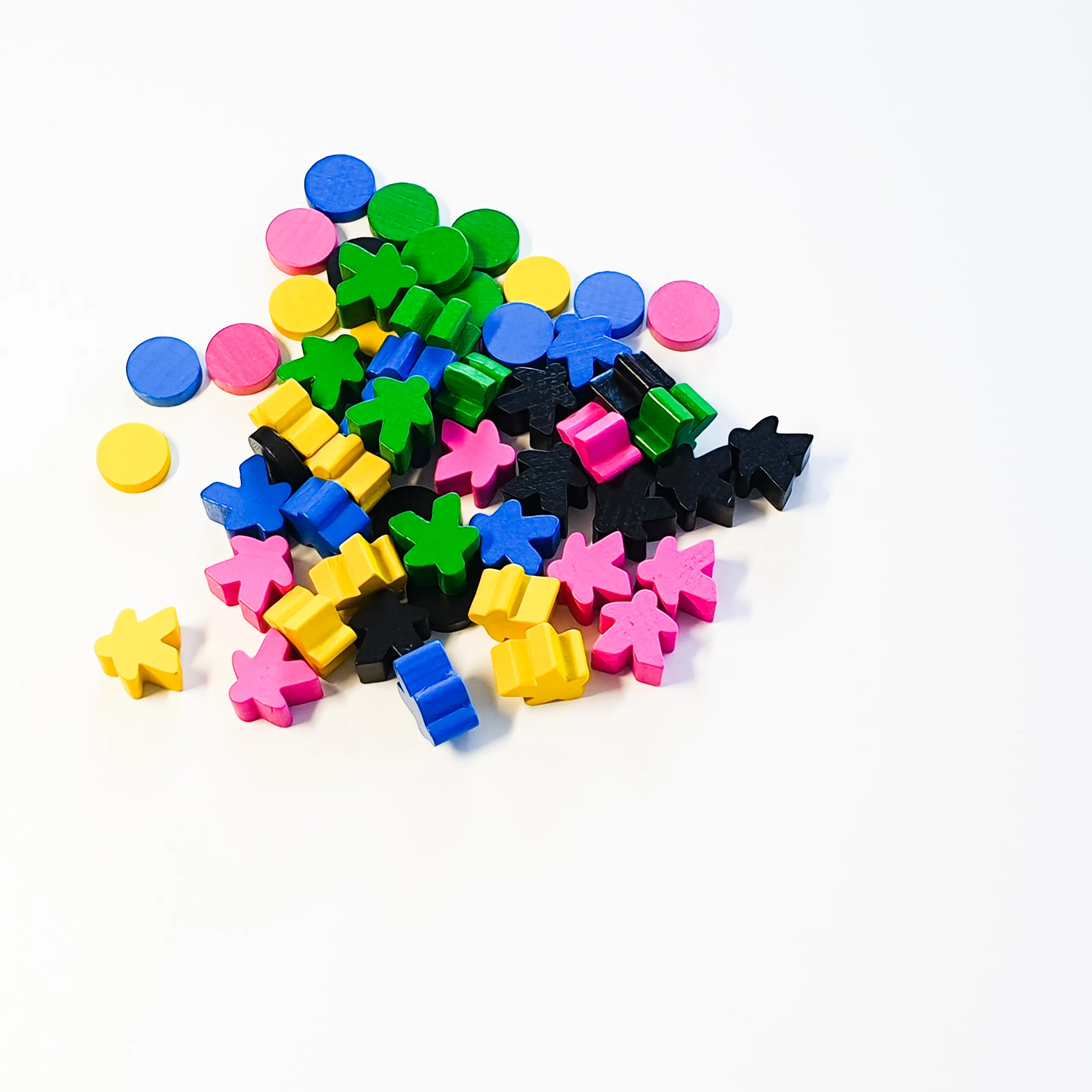
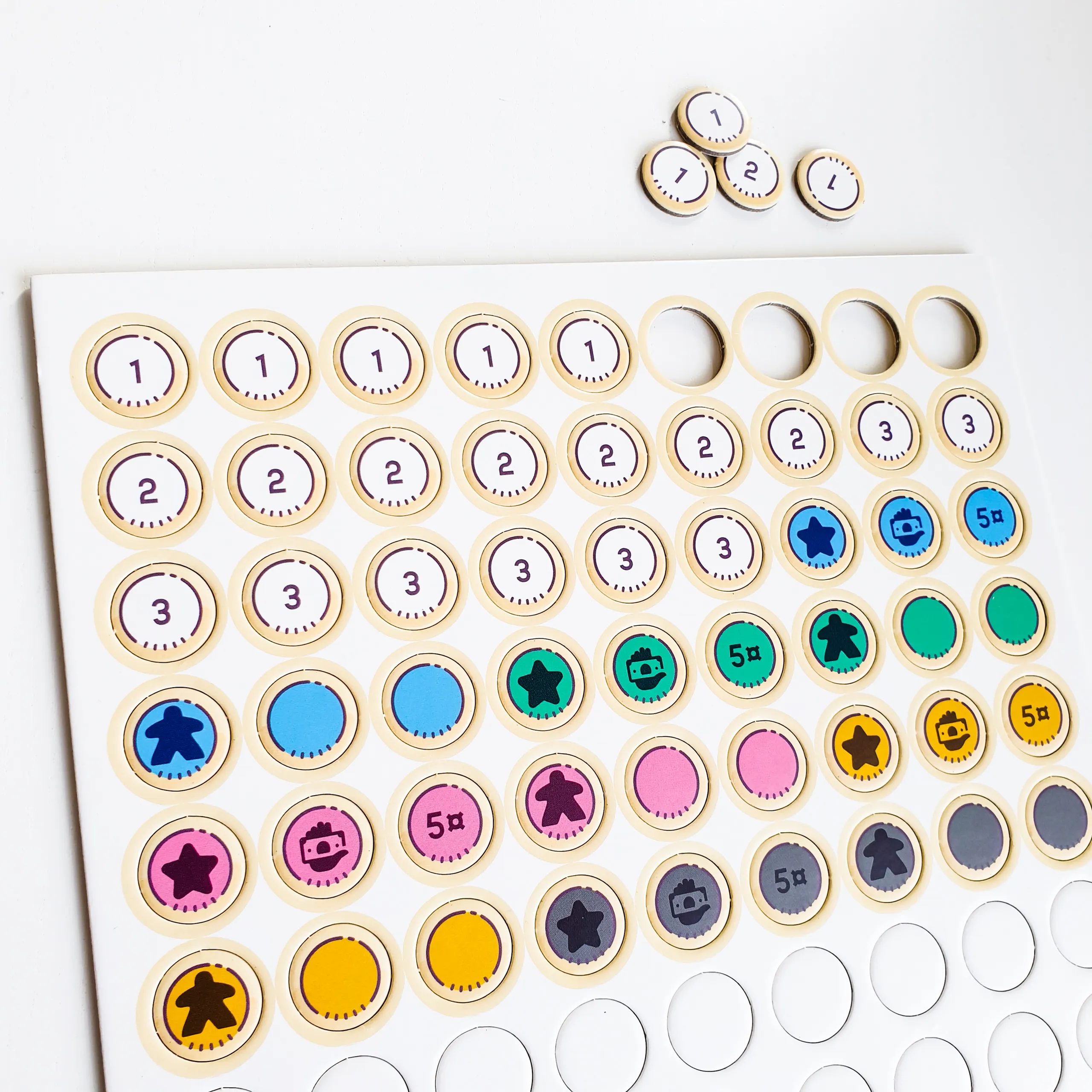
Deluxe components
The handling of coins and crystals is an important part of gameplay, so I searched for versions that would feel good without distracting. The green crystals from original game (that seemed almost radioactive) got replaced with bright red that feels more attractive and appealing.
- Wooden components were chosen so they would work for most cases of colour blindness.
- Tokens are punched from matte-surface 2mm cardboard.