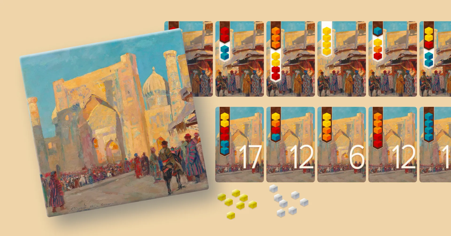
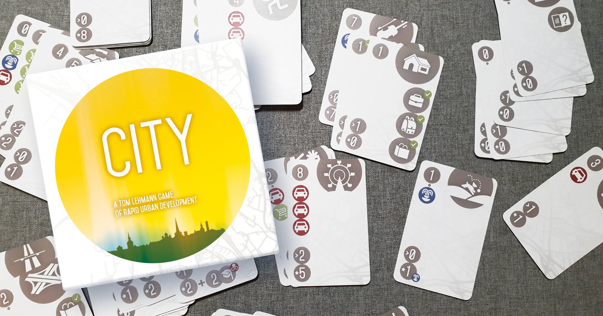
The City
In 2012 at game nights in a friendly local board game store (called Ludo at the time), a regular often brought along his German copy of The City, with translation stickers. I was fascinated by it, and also convinced that the text was not even necessary for such a simple game. So I set out to prove it.
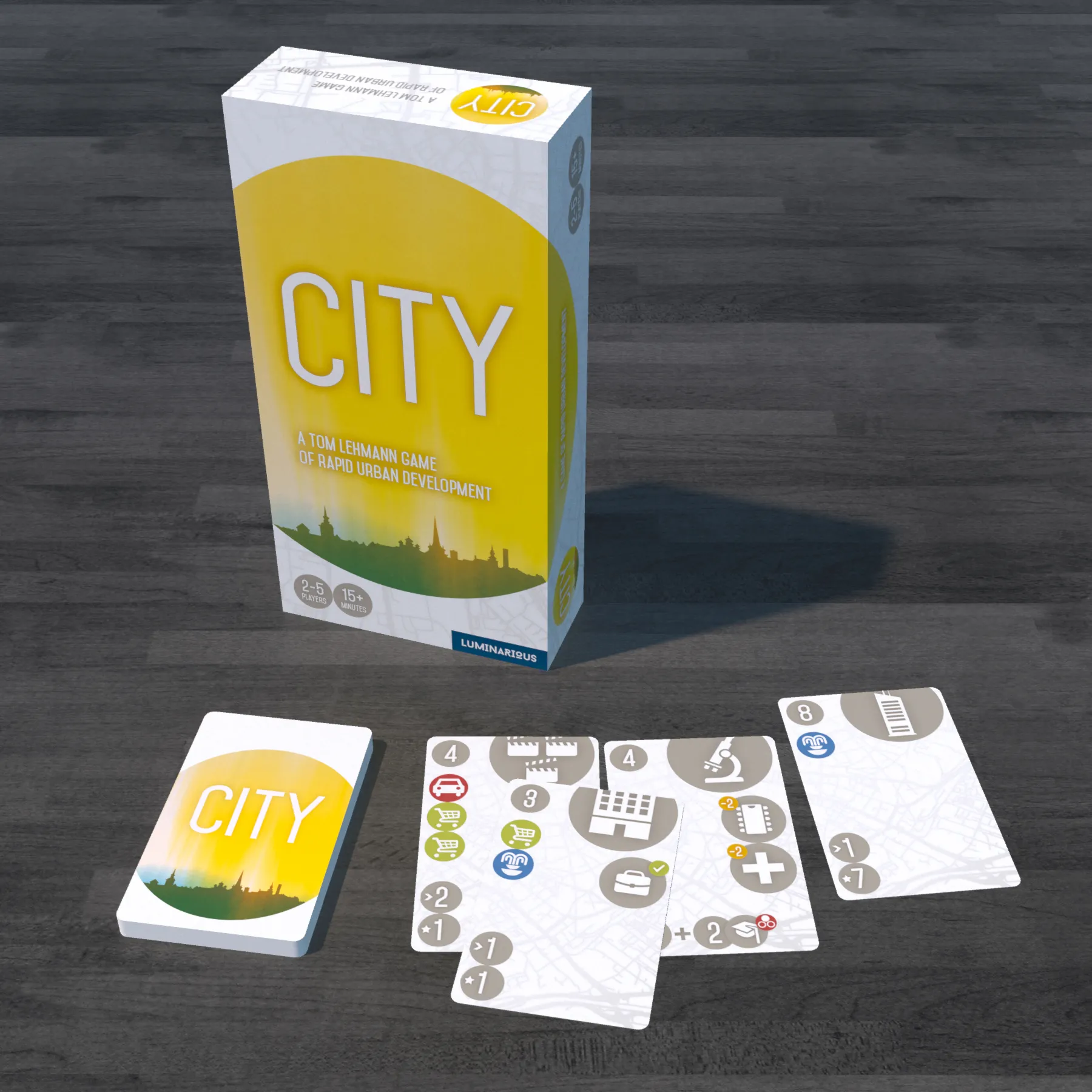
As this render shows, and as other players later commented, I was right 😎. But it definitely wasn’t a quick job and I can see why the game developers didn’t go with this approach.
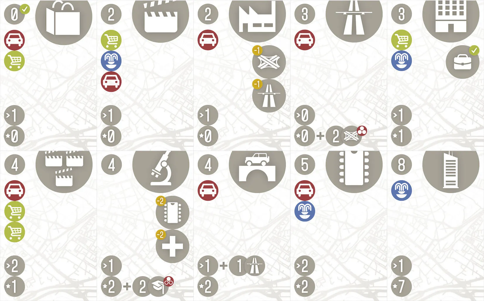
How to make icons from text?
Bulk of the initial work was simply to translate the concepts on the cards into visual language:
- Using a big icon to represent the card itself, keeping at least some vague reference to original
- Card cost stays a number
- Use the dot to notify unique cards (1 allowed per player)
- Use the checkmark on cost to remind that some other card needs to allow this one to be built
- Mark any discounts
- Mark the income and score on bottom left
Most of the icons are from the Windows Metro icon set as it was free and I was just a poor student.
After a ton of iteration with these concepts I arrived at the final solution. It may not be the most marketable design, but it was definitely playable and I learned a lot about designing visual concepts and developing a consistent visual language.
Designing the card backs was a significant challenge, and was likely one of the triggers for me to go deeper into UX design, instead of becoming a graphic designer or an artist.
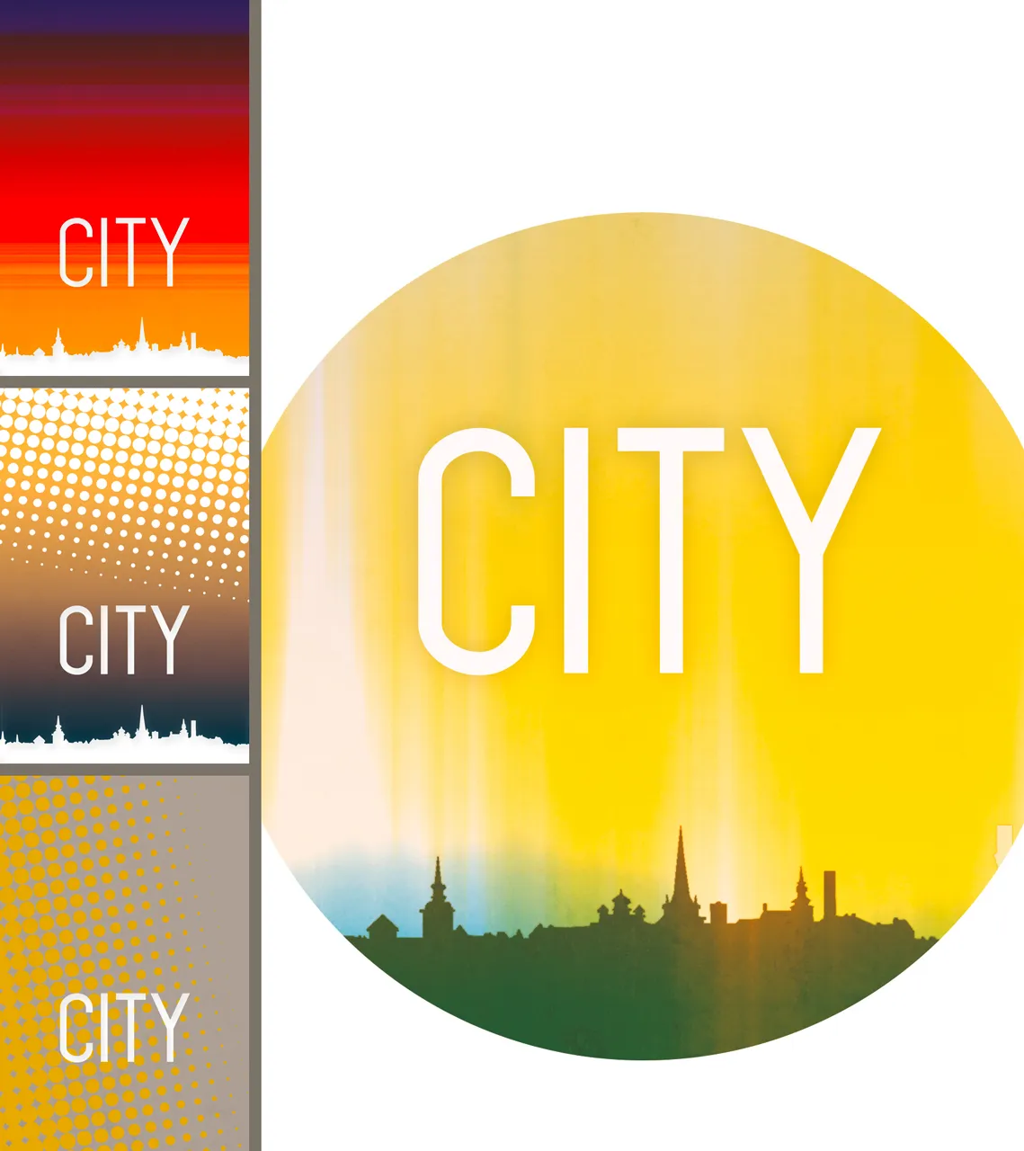
Once I found a motif I liked, I used it for the box as well.
Acknowledgments
I used the Mohave typeface by Tokotype.
I had a great time playing this with Tarmo and others! 😁